The global higher education marketplace is becoming increasingly competitive. That is why McMaster University established in 1887, ranking among the world's top 100 universities needed a brand refresh to distinguish itself in the current market. The Brighter World brand story was established to communicate how students, researchers, faculty, and staff collaborate across disciplines to explore and expand their potential in a globally renowned, innovative education and research community, committed to advancing societal health and wellbeing.
Senior Art Director & Designer / Ariad Communications
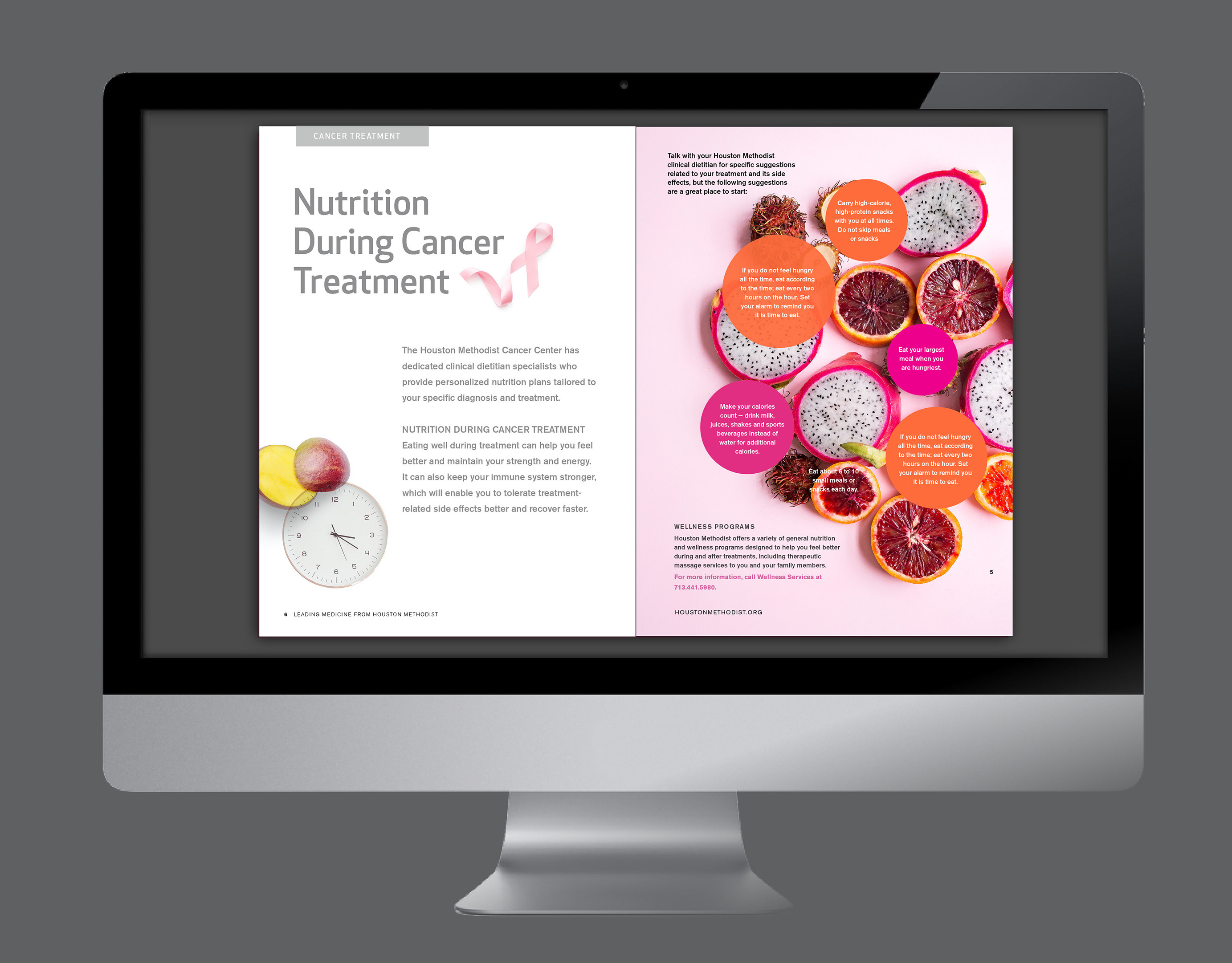
McMaster's Brighter World Applications
Consistently communicating the Brighter World story look-and-feel to various applications.

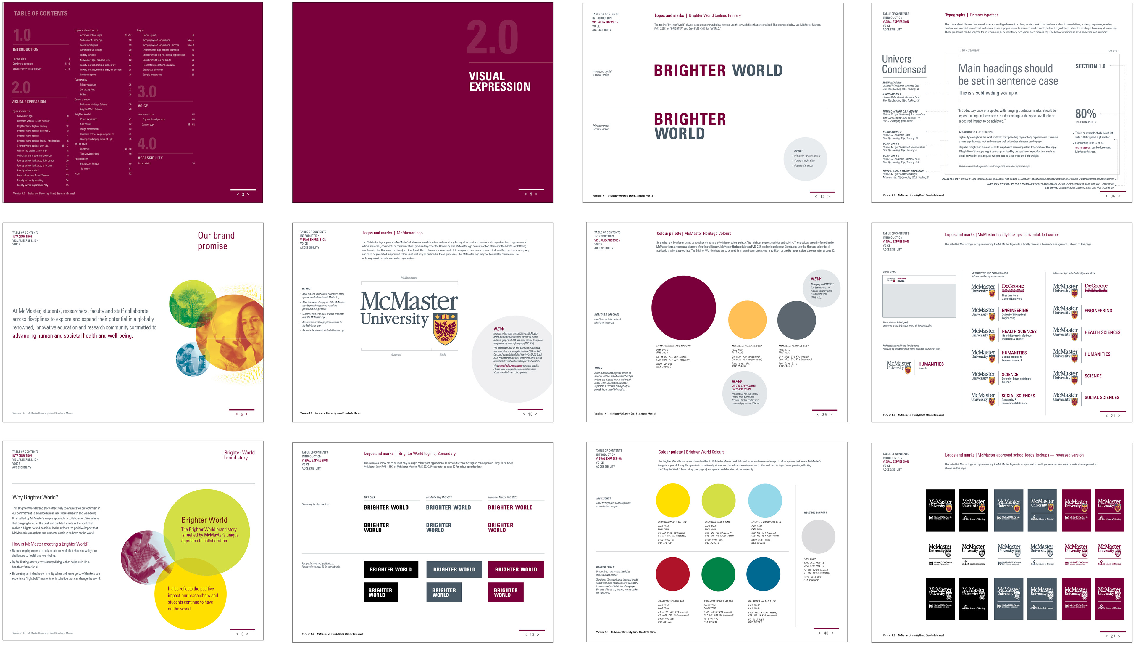
McMaster's Brighter World / Brand Guidelines
To fulfill the scope of work, I refreshed McMaster’s brand identity, without altering the original logo. I created a system of new brand applications with a focus on the established Brighter World theme, designed a new set of McMaster logo lockups in various formats and applications (the University logo accompanied by faculty names, department or administrative names).
(Selected Pages)
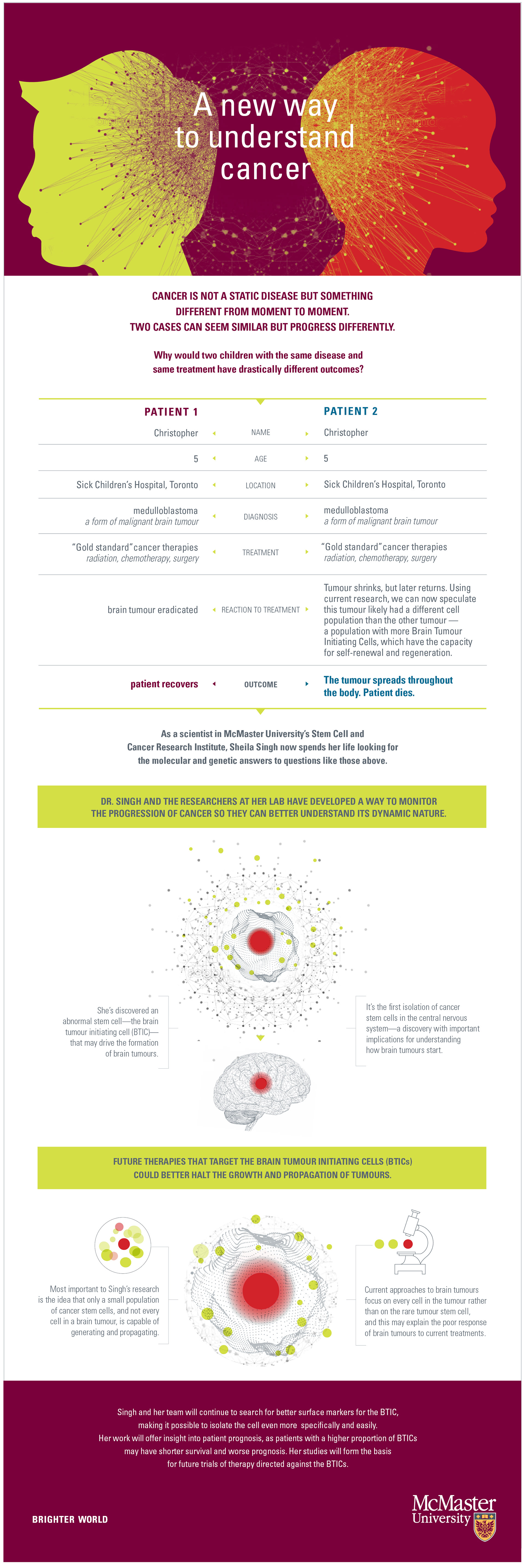
McMaster's Brighter World / RESEARCH STORIES
Creating less but more interesting and informative content but pushing it to more channels was part of the strategy. I designed several infographics to communicate university's research stories, to share information but also to draw more traffic into the university's website.
Infographics with custom photo-composition (below) communicate that boreal wetlands help to regulate the climate and play a key role in preventing forest fire. Customizing visuals and incorporating movements or some interactive aspects was part of my vision to increase engagement with the audience.
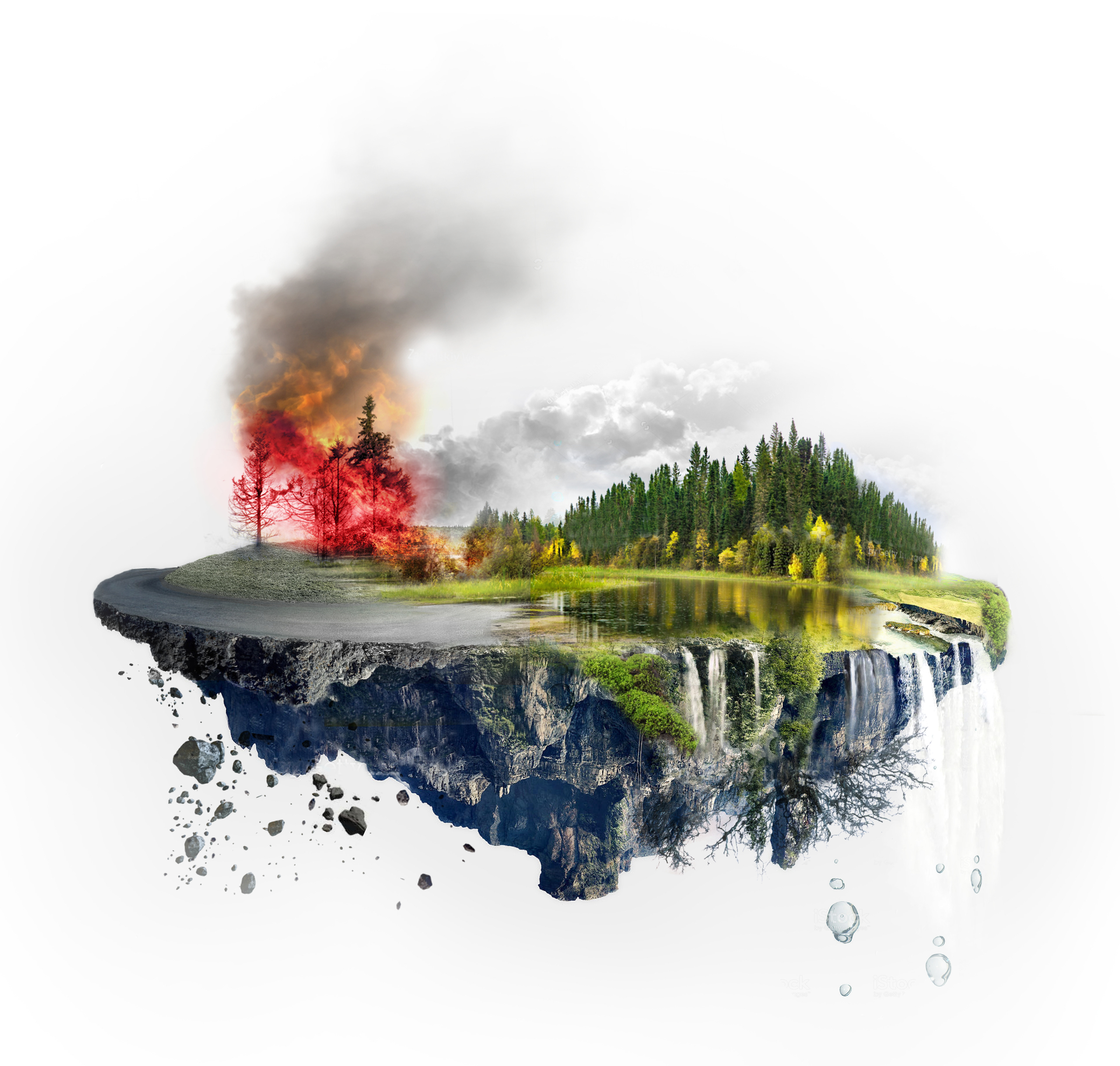

The key element in building successful infographics is to create a bite-size information that could be use as a part of the whole or separately, as an original images for each statistic.